Tuesday, April 28, 2020

13 States: 3 New States and a Peek at Global Numbers

Somehow, 13 days have gone by since the previous post. In this post I will update the numbers for all of the states. Also, as the title of this post mentions, I included Oregon, Ohio, and Illinois. With the inclusion of these three states, the total number of states represented here increased to thirteen. With the thirteen states, it is becoming a bit difficult to discern each of the states' trend lines, which is why I have waited to add more. For a reference point, at the time of this post the global total of COVID cases has increased to over 3,114,000 positive cases, with the US total eclipsing 1 million in the last 24 hours.

As always, the first graph (see Figure 1) represented is the total number of positive COVID cases over time in the thirteen states. Even with the addition of the new states, the trends continue to separate into three distinct groups. Missouri, Arizona, Iowa, and Oregon have the fewest number of cases and curves which are visually flat. Oregon, as one of the states added today, has maintained an incredibly low spread, to date. Iowa has a jump in cases since the previous post. The middle group of states (Maryland, Ohio, Indiana, and Colorado) have not experienced the exponential rate of other states, but are still continuing to increase. The final group (Illinois, California, Pennsylvania, Michigan, and Florida) have experienced a higher growth rate, though Florida appears (visually) to be flatting the curve.

Figure 1. Total Number of Positive COVID Cases over Time in Thirteen States
The second graph has changed slightly since the previous post. Figure 2 formally reviewed trend lines after 40 cases. Now, the graph represents trend lines after 100 cases. In other words, Day 1 on the graph for every state is the first day at least 100 cases were reported. Reorienting the x-axis in this manner allows a comparison between growth rates in the states. With this graph, there appear to be 4 or 5 groupings of states. The leveling off of Florida's growth rate is more evident here, when compared to California. Pennsylvania and Illinois recently surpassed Michigan in the spread of the disease.  
Figure 2. Total Positive COVID Cases over Time aft the 100th Reported Case
At this point, I have not gathered the population data for the new states. However, due the media reports on different tactics in different countries, I created a brief visual comparison. Twenty countries are included in Table 1. The countries included are the top ten countries in the total number of confirmed cases (US, Spain, Italy, France, UK, Germany, Turkey, Russia, Iran, and China), the US's neighbors (Canada & Mexico), the top ten most populous countries not already included (India, Indonesia, Pakistan, Brazil, Nigeria, & Bangladesh), and two countries whose approaches have been heavily publicized (South Korean & Sweden).

Table 1. COVID Cases, Population, Population Density, and Case Fatality Ratio for Twenty Countries
In Table 1, the columns are color coded to indicate the top five countries in each category. The colors represent first (red), second (orange), third (yellow), fourth (green), and fifth (blue) in each column. The United States is first in the total number of cases and third in the percentage of the population with the disease. In other words, yes the country is large, but it also has a very high incidence rate even though is has a very low population density. The United States is also first in the number of deaths, but given the sheer number of cases, the case fatality ratio is average. The European countries which reported over-crowded hospitals are among the highest in the case fatality ratio. The cases per square kilometer are highest in these nations. Of note is Sweden, which has a high case fatality ratio and has received international attention for not imposing social distancing.

As the United States transitions to a period of reopening, I will probably add a few of the early opening states to the graphs (looking at you, Georgia). I will try not to wait 13 days before posting again. Thank you to those of you who checked in and asked when I would post the next graphs. I appreciate it.
As always, Stay Home, Stay Safe, Stay Healthy -JRB


Wednesday, April 15, 2020

Trends in 10 states & new data tools

The last update I posted was 6 days ago. Since then, the ten states included here have deviated into three groups, which will be apparent in today's graphs. As a reminder, the purpose of this blog is to look beyond the accumulative totals in the separate states and compare the trends across states. For a reference, the current global total at the time of this post is 2,034,425, while the US total approaches 620,000. As of this post, the California, Colorado, and Florida numbers have not been released for 4/15/20.

Most states have changed the graphic for how the data is presented on the state's site and the level of detail being reported. Johns Hopkins has also increase the level of detail reported on its site. There is now a US specific map, which can be accessed with a tab on the top of the main page or with the link here. This map gives a high level of detail for every county in the US. The data can be accessed by selecting the county you are interested in viewing and then expanding the infographic. The number of hospital beds, ICU beds, and more is included for every county. The final tab includes critical trends and compares countries. The ability to compare states is not available at this time. When it is, I will no longer publish this blog.

As always, the first graph shows the total number of cases over time in all ten states. At first glance, it is clear that states are falling into one of three clusters. Comparing the population totals (see Table 1) to the growth trends in Figure 1 illuminate this data.  First, the states with the highest populations [range: 998,000 to 3,951,000] have also diagnosed the most extreme number of cases (Michigan, California, Florida, and Pennsylvania). The second group (Indiana, Maryland, and Colorado) also have a similar population [range: 576,000 to 673,000]. The final cluster of states are the states with the slowest spread: Arizona, Iowa, and Missouri. Arizona and Missouri have a similar state-wide population compared to the previous group of states, however the population density is much lower (see Table 1). Colorado is the only state with a low population density which is in the middle group of trend lines. A final note, the high population density of Maryland appears to be impacting the growth trend. Compared to the other states, Maryland is not leveling off (Bending the curve) as quickly. Table 1 shows that although Maryland now has over 1 case per square mile, Pennsylvania and Michigan still have a higher percentage of the total population diagnosed as positive.
Figure 1. Total number of COVID Cases over Time in Ten States
Table 1. Population, Population Density, and COVID for Ten States.
Resetting the x-axis to start with the 40th diagnosed case (See Figure 2), Arizona and Iowa still demonstrate the slowest spread of cases. Missouri, however, is on a similar trend line as Colorado. Maryland and Indiana are also similar. Since the previous post, Florida has significantly decreased the rate of spread, as compared to Pennsylvania.
Figure 2. Total Number of COVID Cases over Time for Ten States, after the 40th Reported case
The final pieces of data for today are related to testing and mortality in each state (see Table 2). Although a couple weeks ago I suggested the percentage of positives would decrease, that has not been the case. In fact, the percentage of positives is increasing. This means that wide-spread testing still is not implemented. Most states continue to have restrictions on who can access a test. In other words, testing is not available to identify the asymptomatic carriers of COVID-19. Only after implementing wide-spread community testing will the percentage of positive decrease. I naively assumed the country would have that at this point. As for deaths related to COVID, Michigan continues to have both the highest number of deaths and the highest death rate, compared to the other 9 states. Colorado and Indiana are the only two other states above 4%.  Another important statistic is the percentage of the total population tested in each state. Only Pennsylvania (1.07%) and Florida (1%) have tested at least 1% of their populations, followed by Maryland (.92%), Michigan (.91%), Missouri (.82%), Indiana (.72%), Colorado (.69%), Iowa (.63%), Arizona (.62%), and California (.55%).

Table 2. Number of Deaths, Death Rate, Total Tested, and Percentage Positive for Ten States. 
Summarily, although everyone is eager to restart a semblance of normalcy, the availability of testing is the largest hurdle to achieving that goal. Until the country is able to identify the asymptomatic carriers of the disease, restarting the country could be disastrous. So, until that time, Stay Home, Stay Safe, Stay Healthy -JRB

Thursday, April 9, 2020

10 States: 5 with Race/Ethnicity Data

In Tuesday's post I spent a bit of time reporting the race ethnicity data that was available. I mentioned that because of what the early data was reporting, there would be a call for more states to disaggregate the data by race/ethnicity. Sure enough, today there are five states reporting the start of some race/ethnicity data. Since this was not a focus for the last several weeks, it was mentioned that some of that data will most likely never be reported, especially if the patient was not admitted to a hospital. We will make due with what we have.

As a reminder, the focus of this blog is to look beyond the daily reported national and state level totals and analyze the trends within and between states. For context, the global total as of this post exceeds 1,600,000 and the US has over 465,000. As a note, New York state (161,000) has more than the next closest nation (Spain at 153,000). There is a lot that can be said there, but I will let those numbers speak for themselves.

I did not post yesterday, but there was big news in Maryland with yesterday's data release. You can see on Figure 1, the Maryland trend line took a dramatic leap yesterday. It was reported that a number of previously unreported cases were added to the numbers. In other words, these were positives from around two weeks ago. With the addition of those backlogged tests, Maryland and Colorado are nearly identical, with totals just under Indiana's. Another note, Florida's data continues to be erratic. At this point Pennsylvania has exceeded Florida and will surpass California in the next day or so. Iowa, Arizona, and Missouri are thankfully holding steady.

Figure 1. Total COVID Cases over Time in Ten States
The second chart (see Figure 2) reorganizes the x-axis to show cases from a common starting point, once a state reported its 40th case. There is not much new information to examine except that Colorado held steady at the point where California had spiked. Figure 3 demonstrates the percent increase in cases compared to the previous day. Although the number of cases will continue to rise, as long at the daily percent increase is decreasing, we are on the right track. Outside of Maryland's increase yesterday, the general trend for all ten states is downward. 

Figure 2. Total COVID Cases over Time after 40 Reported Cases in Ten States
Figure 3. Daily Percentage Increase in COVID Cases for Ten States. 
Finally, as I mentioned at the start, five states are now reporting race/ethnicity data. The first state for today will be California. These next three images are all California data. The center graph is the census data. If COVID was even distributed across all race/ethnicity, then the top graph (total cases) and the bottom graph (COVID deaths) should look identical to the center graph. Overall, California seems to be reflective of the census data. However, the state has only reported 54% of the confirmed cases as of today.

Figure 4. Pie Charts for California COVID Cases, Census Data, and COVID Deaths
Michigan and Florida are two states with disproportionate distributions of cases or deaths. Since Michigan numbers were reported last time, we will look at Florida today (see Figure 5). Although the Census graph and the death graph look similar, the cases by race/ethnicity is visually different. The large 33% section in the top graph represents unknown cases. However, we can see that Hispanic/Latino Floridians have a high proportion of cases compared to the percentage of the population they represent, yet are dying at lower rates. However, White Floridians represent a smaller proportion of their percentage of the population, yet are dying at higher rates.

Figure 5. Pie Charts for Florida COVID Cases, Census Data, and COVID Deaths 
There will be much discussion in the following weeks, months, and years regarding the racial/ethnic disparities of this disease.  One piece of data we will never have is socio-economic status (SES). Although hospitals collect basic demographic data on patients as instructed by the CDC, they do not collect SES data. It is too early to tell, but due to significant systemic factors, lower SES folks are most likely going to be impacted significantly. This includes both the rural poor and the urban poor, as they make up the essential workers staffing the food industry and the essential businesses (Target, Walmart, etc.). So for their sake, remember to Stay Home, Stay Safe, and Stay Healthy. JRB

Tuesday, April 7, 2020

10 States: Population and Testing Data

Today's entry includes more graphs and charts than normal. Most will be updates of graphs previously shared in this blog, some will be new.
The purpose of this blog is to look beyond the state and national totals and compare the trends across states. Ten states are currently included in this data. For added context, at the time of publication, the global total was over 1,428,000 and the US total exceeds 398,000.

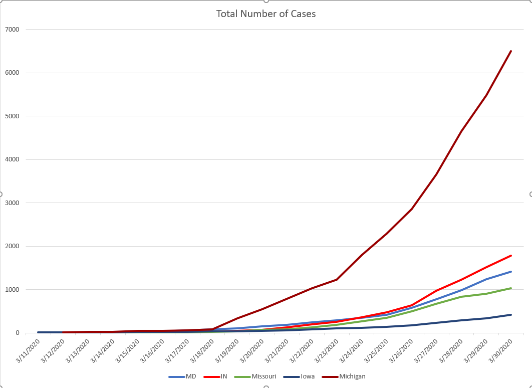
As always, Figure 1 depicts the increase in cases over time in ten states. It is difficult to ignore Florida in this image; it is the only state without a smooth curve. I mentioned previously that Florida is the only state with multiple points during the day that data is released. We can speculate that the data reporting intervals could have something to do with the erratic line. The bend in the curve is evident in Colorado, which dipped under Indiana today for the first time in total number of cases. Arizona and Maryland also have visible changes in the slope.

Figure 1. Total COVID Cases over Time in Ten States

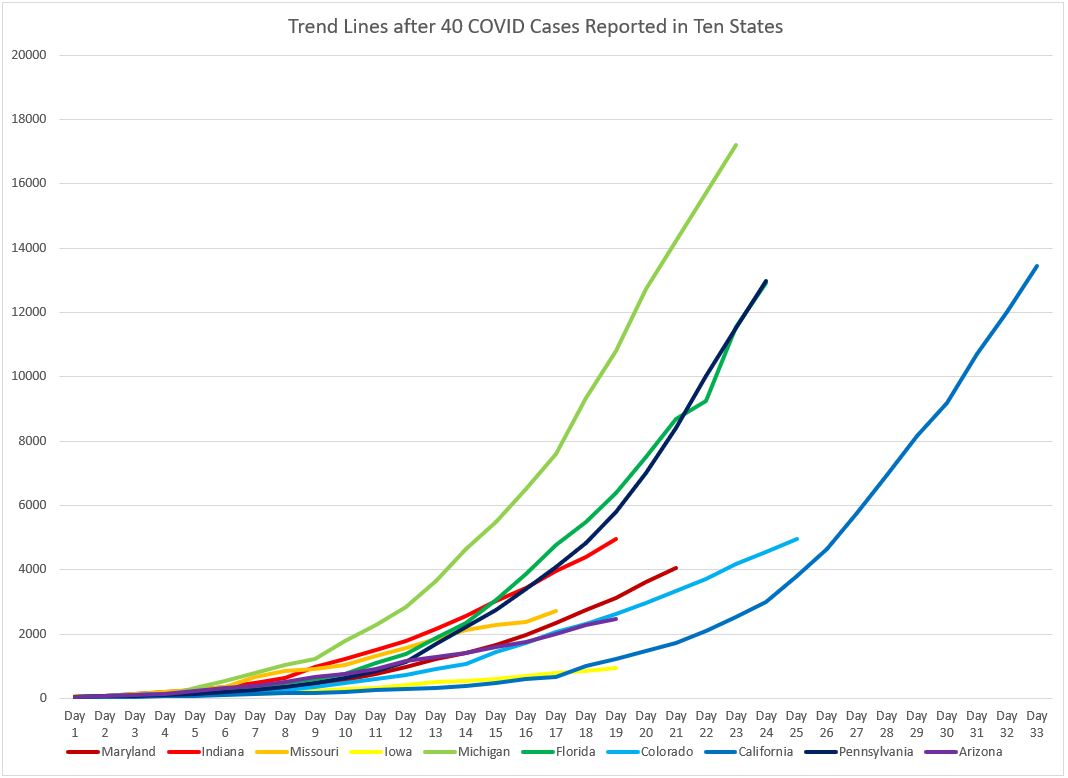
Figure 2. Total COVID Cases over Time after 40 Cases Reported
Figure 2 represents the total cases over time after the 40th reported case. This allows or a more direct comparison. Pennsylvania and Florida remain nearly identical. When looking at Figure 2, it is helpful to remember that the four states with the greatest number of cases are also the four states with the greatest population (see Table 1). As reported previously and still true today, Maryland has the highest population density and number of cases per square mile. Michigan remains the highest state of the ten in percentage of the population testing positive. It is worth note, Pennsylvania is creeping up, currently second in both categories.

Table 1. Population, Square Miles, Population Density, and COVID in Ten States
The next figure included here is new. Figure 3 is a visualization of the good news reported in yesterday's post. The daily percentage increases in every state are decreasing. In other words, even though the numbers continue to rise, the speed (or slope of the curve) of the spread is slowing. Each column here represents the percentage increase in the number of cases compared to the previous day, in that state. The downward trend of all the columns is evident when looking left to right.

Figure 3. Daily Percentage Increase of COVID Cases in Ten States
Figures 4 and 5 represent an update to the testing data. Figure 4 depicts the total number of tests each state has reported as of today. Wide scale testing is one thing the public health experts would like to achieve in combating this virus. It is important to look at the total testing numbers in context of the state's population (see Table 1). For instance, California has the greatest number of tests, which represents 0.4% of the population. Indiana (0.43%), Iowa (0.4%), Michigan (0.44%), Colorado (0.49%), and Arizona (0.46%) have all tested a similar proportion of the population. Maryland (0.52%), Missouri (0.55%), Florida (0.65%), and Pennsylvania (0.71%) are over one half of a percent of the population (which, let's be honest, is not great). Of those tests, the percentage positive is also important (see Figure 5).
Figure 4. Total Number Tested for COVID in Ten States
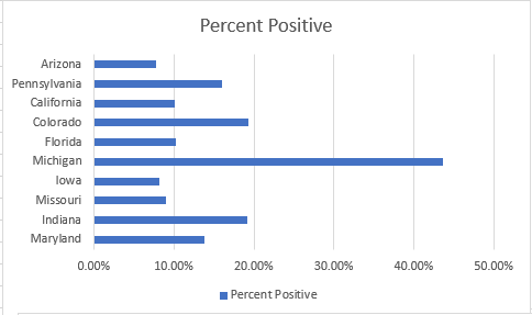
Figure 5. Percentage of Positive COVID Cases in Ten States
Figure 5 shows that Michigan's percentage of positive cases remains drastically higher that the other nine states. As time goes on and more testing is implemented, this number should decrease in every state. The fact that these numbers remain high suggests that the country is not yet testing at the level recommended.

The final piece of data for tonight is relates to the reported race and ethnicity of cases. In my "real research" I examine racial trends in education. Of all this data, this is the closest thing to my expertise. A few days ago I mentioned the data was not good around race and ethnicity, and I mentioned that the number of "unknown" race/ethnicity was too high to really examine the data. That remains my stance today. However, I decided to present the data since the topic is beginning to be broached in the media. The first thing to point out is that only two states have this data publicly available. Second, the number of "unknown" race remains very large, especially in Florida. The Michigan unknown numbers have decreased in recent days.

The columns titled "census" for each state are the percentages of the population which make up each race/ethnicity. The COVID columns are the reported positive in each state by race/ethnicity. When I look at this data I see two things. First, the percentage of White positives in both states is disproportionately low, compared to the total population. Even if every unknown was White, the percentage would not be close to the percentage of White people in Michigan. Second, the Black/African American numbers are disproportionately high in Michigan. This most likely represents the population of Detroit and other cities in Michigan. One thing is clear, the disproportionality in the data will lead to other states reporting this data as well.

Table 2. Race and Ethnicity Data and COVID in Two States
Finally, the mortality rate across all states appears to be consistent [range 1.75% - 4.45%]. Missouri  has the lowest rate, with Pennsylvania, Maryland, Iowa, California, Arizona, and Florida under 3%.  Indiana (3.14%), Colorado (3.3%) and Michigan (4.45%) have the highest mortality rates.

It is projected that the mortality rate will spike after the spike in the number of cases. In other words, we can expect these percentages to increase in the next few weeks. As always, Stay Home, Stay Safe, Stay Healthy -JRB

Monday, April 6, 2020

10 States: Updating after the Weekend

First, there is some good news in the numbers reported today. Although it will not be readily apparent in the first graphs, the trends are shifting.

As a reminder, the purpose of this blog is to look at the state level data beyond the totals in each state and to examine trends over time, compared to other states. Presently, this blog includes ten states which vary in size, population, and response. At the time of this post, there are over 1,331,000 cases across the globe and 356,000 cases in the US.

As always, the first graph (see Figure 1) depicts the number of cumulative cases over time for ten states. Over the weekend, several states are now publishing the graph of cumulative cases on their state websites. However, not all states have posted this information as of today. Additionally, states focus on their data, meaning it is not easy to look at states in comparison to each other when it comes to the spread of COVID-19. The federal government has published these trend lines once, that I know of (see previous blog post dated 3/31/20). In Figure 1, you will notice that California, Florida, and Colorado have yet to update their daily numbers as of this post. Florida is the one state which updates their number throughout the day, while all other states release their numbers at a regularly scheduled time each day. Obviously, the Western states post their updates later in the day. There is a fairly clear split in the acceleration of cases, with Michigan, Florida, California, and Pennsylvania (the four most populous states included here) reporting vastly more cases than the other 6 states.

Figure 1. Total COVID Cases over Time in Ten States
In Figure 2, the x-axis is re-positioned. Day 1 for every state is the day at least 40 cases were reported. Examining the data in this way allows for a more direct comparison of the growth of cases. For instance, in Figure 1, California and Florida appear nearly identical. However, Figure 2 shows that the growth in California is much slower. Pennsylvania and Florida are more similar when viewing the data through this lens. In recent news, there has been emphasis on the lack of stay-at-home orders in a few states. Iowa is one state which has not yet implemented a mandatory stay-at-home order. Since the first day Iowa was included here, it has maintain the lowest position in reported cases. However, Figure 2 shows that Iowa and California were not that different through the first 19 days after the 40th reported case. Meaning, it is still possible for Iowa to experience exponential growth.

Figure 2. Total Cases over Time after 40 COVID Cases Reported in Ten States

The last piece of information today provides a glimmer of hope. As mentioned previously in this blog, the reported positive cases are always a bit behind the actual numbers. In other words, the changes we make in behavior today (stay-a-home orders, wearing masks, etc.) will be reflected in the data several days after implementation. Table 1 shows the average increase in the number of cases for two date ranges. The first row is the average percentage increase in cases from the previous four days. The second row is the average percentage increase in cases from the four days prior to that. This data shows that the spread in Indiana, Missouri, and Michigan has slowed the most, of the ten states reported. In other words, although the cases are still increasing over the weekend, they are not increasing at as high of a rate as they were the four days prior. Looking back at Figure 2, you can see a slight shift in the slope of Michigan (light green). To put it in terms we are now all too familiar with, the curve is starting to bend. 

Table 1. Average Percentage Increase in Cases over Four Days for Ten States 

All ten states have a decrease in the percentage of new cases over these two date ranges. One can infer that the behavior changes implemented in the previous two weeks are beginning to be evident in the data. However, some of the changes are so small (Florida, Maryland, Colorado, Pennsylvania, & Arizona), it is difficult to know if it is a decreased trend or a blip in the data. Only time will tell.
So, as always - Stay Home, Stay Safe, Stay Healthy - JRB

Thursday, April 2, 2020

10 States: Testing Data

The purpose of this blog is to look beyond the total number of cases in each state and examine the trends, relative to other states. However, for the purpose of context, the worldwide total as of this post is over 1,014,000 with over 244,000 in the US.

Today is an update on the testing data. The totals in each country and in state are only as accurate as the availability of tests. Before the updated testing data is presented, you can see both the total cases over time for ten states (see Figure 1) and total cases over time after 40 cases were reported (see Figure 2).


Figure 1. Total COVID Cases over Time for Ten States
Figure 2. Total Cases of COVID over time after 40 Cases Reported
As for the testing data, Figure 3 shows the total number of tests completed in each state, while Figure 4 reflects the percentage of tests positive in each states. California and Florida appear to be ahead of other states in testing, but all of the sames are comparable when factoring in total population. In other words, the percentage of the states' population tested across all ten states is consistent [range 0.21% - 0.43%]. Iowa (.21%) has tested the smallest percentage of its population, followed by Indiana (.24%). On the other end, Pennsylvania (.43%) has tested the highest percentage of its population, followed by Florida (.37%). The other six states are nearly identical in testing percentage. 
Figure 3. Total Tests Competed in Ten States

Figure 4. Percentage of Positive COVID Tests in Ten States
As for percentage positives, Michigan's numbers are still incredibly high. As stated previously, it was announced that Johns Hopkins will be testing around 1000 per day in Maryland as of yesterday. Hopkins also has facilities in Florida, however I do not have knowledge of their procedures. This brings me to another testing difference, whether or not people can access testing. Again, I can speak to my personal knowledge of testing in Maryland. Employees of Hopkins have a phone number to call if symptomatic. I am aware of individuals who called the number, scheduled their test, took the test, and had results in about 28-32 hours (from report to results). Most Americans have a very different experience. One company reported having 160,000 test samples waiting to be analyzed. I say this to emphasize the point that the numbers reported by most states are several days behind actual totals. Also, since the country was not able to adopt a wide spread testing procedure, we will never know the number of asymptomatic cases. Testing capacity in each states plays a significant role in the data each state is able to report. From the data, one thing is starting to be clear, gender makes a difference. 


Figure 5. Percentage of Positive COVID Cases by Gender
Figure 5 represents the gender distribution for nine of the ten states. Pennsylvania does not report gender demographics at this time. Some states do not add up to 100% because gender was not always reported. Overall, the distribution is fairly even between males and females. However, the mortality rates identified a few days ago with the initial numbers are holding consistent. Of the three states reporting gender demographics of people who have died of COVID (see Figure 6), males represent around 60% of the mortalities, compared to 40% of females. In other words, the preliminary data suggests men are more likely to die from COVID than women. As more states begin to report the demographics, I will continue to report on this element. The overall mortality rate of the ten states remains around 2% [range: 1.04% - 3.86%]. Missouri (1.04%), Pennsylvania (1.28%), Maryland (1.54%), Florida (1.66%), and Iowa (1.79%) have the five lowest mortality rates, while Arizona (2.00%), California (2.21%), Indiana (2.57%), Colorado (2.60%) and Michigan (3.86%) have the highest rates of the states examined. 


Figure 6. Mortalities of COVID by Gender

There has not been a significant change in the age distribution of the states. Therefore, I will not include those graphics today. Other testing data is inconsistently reported. Michigan is the first state to report positives disaggregated by race/ethnicity. However, the number of  "unknown" is so high (30%), is would be irresponsibly to discuss distributions until other states also begin to report more demographic data. Finally, hospitalizations are being reported in six of the ten states. However, the numbers are cumulative, so comparing hospitalizations to hospital capacity would not be meaningful. 


As always, Stay Home, Stay Safe, Stay Healthy - JRB

Wednesday, April 1, 2020

10 States total: Adding Arizona & Pennsylvania

Today two more states are included, bring the total states to ten. These are the last states I will add this week, so there is a chance to look at other data related to these ten states on Thursday and Friday of this week. The purpose of this blog is to look beyond the total number of cases in each state and examine the trends, relative to other states. However, for the purpose of context, the worldwide total as of this post is over 932,000 with over 213,000 in the US.

Today's post will be identical to yesterday's; I will report the same figures and tables, with updated numbers, and including the two new states, Arizona and Pennsylvania.

Figure 1. Total Number of COVID Cases over Time in Ten States
As always, the first graph (see Figure 1) shows the total number of diagnosed positive cases over time. This graph and the next one are important representations, since the public message is to "bend the curve." However, of the ten state data sources included here, none include a visualization of the curve as of today. The trends are holding for all of the states previously examined. Of the new states included, Arizona has a slight decrease in the rate of positives. The next couple days will show if this is a trend, or if it is a one day blip in reporting. The other new state, Pennsylvania, is on the upward trajectory seen in the three states with the most cases represented in this visual (Michigan, Florida, and California). One last note on Figure 1, you will notice that on 3/25/20, Pennsylvania and Colorado were nearly identical in the total number of cases. After that date, Pennsylvania cases grew exponentially, while Colorado held a steady, more linear path.

Figure 2. Total Cases of COVID over Time After the 40th Case Confirmed
Since the spread of the disease across the country means that states will be impacted at different times, it is valuable to reset the X-axis from a common stating point. In Figure 2, Day 1 is the day each state reported the 40th case. Examining the curves in this way show the growth in each state that can be compared to the other states. For instance, on Day 14 after the 40th case, California actually had fewer cases than Iowa on Day 14. Florida and Pennsylvania are following a very similar growth pattern. Arizona is difficult to see (in purple), but on Day 14, it has nearly the same number of cases as Maryland's Day 14. Hopefully, Indiana can keep the curve down in the next couple days, and does not follow the same trend as Florida and Pennsylvania.

One thing not mentioned in several days is the percentage change from the previous day [range: 9.6% to 22.6%]. Arizona (9.6%) and Iowa (10.5%) have the smallest percentage increase from the previous day, followed by Colorado (12.7%), Florida (17.3%), California (17.6%), Indiana (18.8%), Missouri (19.1%), Maryland (19.6%), Pennsylvania (19.9%), and Michigan (22.6%).

Finally, since new states are included, it is important to look at the population and population density of the new states in comparison to the states previously examined. Table 1 shows the data on all ten states and includes the total number of COVID cases reported by each state as of 8pm EST. Pennsylvania and California have a similar population density, but the percentage of the population with COVID in Pennsylvania is more than double the percentage of California. Maryland still has the highest population density of the ten states and the most cases per square mile. Michigan still has the highest percentage of the population who have tested positive. Arizona has a low population density and is more similar to Iowa in the percentage of cases than to Colorado, both states which also have a low population density.

Table 1. Population, Square Miles, Population Density, and COVID for Ten States. 
Tomorrow I will update the testing numbers. I saw a report today that mentioned over 150,000 tests are waiting to be analyzed, with a ten day waiting period. Meaning, any data that you see here or reported on state websites, is only as recent as the tests which have completed the specimen analysis.  As experts have said from the start, the numbers drastically underestimate the reality. Meanwhile, yesterday I received an email from Hopkins Medicine which stated they have capacity to test 1,000 per day as of today. They are prioritizing patients who are "...older, male, and those who have a history of cardiovascular conditions, or pre-existing lung disease." I have not heard the emphasis on testing men reported widely, but the evidence examined in this blog on Monday supports that strategy. Look for more emphasis on gender in the next few days.

As always, Stay Home, Stay Safe, Stay Healthy. JRB

Tuesday, March 31, 2020

Adding 3 states: California, Colorado, & Florida

In the previous posts, the focus was on the first five states: Indiana, Maryland, Missouri, & Iowa. Today, California, Colorado, & Florida are added to the graphs. Similar to the other posts, today will be an update of all of the states' totals as well as updates to some of the other information which was previously explored. The purpose of this blog is to look beyond the total numbers at each state and to increase understanding of the trends in each state.

As I gathered the information on the new states, I realized that zero states in this analysis have a graph over time of the totals. The big push from the experts is to "bend the curve." However, none of the states are providing a visual of their curve. This evening, in the national briefing, Dr. Debbie Birx provided a visual of all 50 states included in one chart. You can see that graph here at time stamp 19:45. The data included here is the same data visualized in that graphic. The only difference is, with fewer states included, you can more easily see the trends of each state. In gathering the new data, Florida has the best data display (by far) compared to the other seven states (see it here). It includes a lot of the information examined previously in this blog. However, even Florida does not report the trend line of cases over time.

Figure 1. Total Number of COVID Cases over Time in Eight States
In Figure 1, you can see three of the states represented here following the sharp exponential growth trend (Michigan, Florida, & California). The other five states have not yet experienced that level of growth, and hopefully will not. A closer examination of the new states included in this figure shows that California's case began long before the reports in other states (this will be evident in Figure 2). Florida reported cases after California, but the spread in Florida has outpaced all of the states included in this graphic, besides Michigan. Hopefully, this figure is a clear demonstration of the push to "bend the curve." Iowa continues to report the lowest numbers of all eight states. Another element of note in this graph is the rise in cases at the exact same time in many states. This simultaneous rise is catastrophic for the health care system across the nation, since all states need supplies at the same time.

Adding in the three new states, it is worth looking at the state totals again from a common starting point (see Figure 2). Previously, that starting point was the reporting of 15 cases. This starting point has changed for today to reporting of 40 cases. This is primarily due to California, which reported over 40 cases back on March 5. In Figure 2, the growth trends of the three high volume states tell a different story. California currently has a large number of cases, but as mentioned previously, it took much longer for the state to get to that total. Of the eight states, Michigan is still experiencing the most extreme trajectory of cases.
Figure 2. Total Cases over Time, after 40 COVID Cases Reported in Eight States
Finally, it is worth revisiting the population data, now that other states are included. Table 1 includes the updated total number of cases, percentage of total population, and cases per square mile for each state. Maryland remains the most densely populated state of the eight states represented. Most people will realize that California and Florida are larger in population, by far, compared to the other states. Also, Colorado and California are larger that the others in square miles. Looking at how these geographical and population elements relate to COVID, of the states included, Michigan has the highest percentage of the population with the disease, followed by Colorado. Maryland has the largest number of cases per square mile, followed by Michigan and Florida. Colorado has roughly the same population density as Iowa, but the 3x the percentage of population diagnosed positive.

Table 1. Population, Square Miles, Population Density, and COVID for Eight States
 Looking at all of this data in totality, it is no surprise that the experts are warning that Michigan could be one of the next hot spots. Florida has also been mentioned. This data illustrates the importance of following the guidelines set forth by the CDC. One week ago, on 3/24/20, Michigan had 1791 cases. Today the reported positives in Michigan are 7615, an increase of 425%. 

As of this posting, the global total is over 857,900, the US total over 188,000, and in my county, 227 positive cases have been reported (which is nearly half of all the cases in Iowa). So, as always...

Stay home, Stay healthy, Stay safe.
JRB


Monday, March 30, 2020

5 States: testing breakdown

The purpose of this blog is to examine the state level COVID cases, beyond simply reporting the totals. Examining trends allows for a more complete understanding of the pandemic. The purpose of this blog is not to increase your anxiety, but to increase understanding of the data.

The focus of today's post is two-fold. First, to update the reported cases for each of the five states. Second, to examine the demographic distributions of the positive cases, across each of the states. As of this writing, the global total exceeds 775K and the US is just under 160K. I will not add another state today, since the focus is on the demographics of the cases. Additional states will be included tomorrow. 

First, an update on the data for the five states. I did not update the data over the weekend; in Figure 1 you can see how the total number of positive cases in each state has changed since the last post on 3/27/30. Unfortunately, in the past 24 hours, both Maryland and Iowa reported an outbreak in a nursing home. Today's totals in those two states reflect those outbreaks.  

Figure 1. Total Positive Cases of COVID in Five States, over Time
As the trends continue in all five states, the next aspect to examine (for the first time here) is focused on the testing. All five of the states now report the total number of tests. Figure 2 and Figure 3, taken together, demonstrate the scope of testing across each state. Michigan has tested more people than any of the other four states, but also has the highest percentage of positives, as well as the highest number of cases. In other words, similar to how experts are describing New York, Michigan most likely had community spread long before the testing began in the state. Missouri on the other hand, is testing at a high volume and has one of the lowest percentage of positive cases. Missouri is the best case of the five states when it comes to testing. As more tests become available, the percent positive will decrease even as the cases continue to rise exponentially. 

Figure 2. Total Number of COVID Tests in Five States


Figure 3. Percentage of Positive Cases in Five States


The age of people infected with COVID has been a focus since the start of the pandemic. It was reported early that the disease impacted older adults. Four of the states are represented below in the four pie graphs (see Figure 4) . Iowa is not included here because the state is reporting cases in 20 year age increments, while the other 4 states are reporting positive cases in each decade of age. In reality, Iowa's data follows the same trend. However, keeping the visual to these four states illustrates the consistency. If the ages are difficult to read on the screen, the lighter blue wedge at the top (12:00) is 10-19, and each decade thereafter is around the pie, clockwise. Maryland has reported 5 cases in children ages 0-9. Those numbers are included in Maryland's 10-19 wedge. Overall, there are some differences in percentages across the states, but the trends are fairly consistent. Anyone can contract the virus. 

Figure 4. Positive Cases by Age Range in Four States

Finally, a note on mortality. The percentage of people dying from COVID compared to the number of cases in each state is fairly consistent [range 1.06% : 2.83%]. Maryland had the lowest mortality rate (1.06%), followed by Missouri (1.26%), Iowa (1.42%), Indiana (2.18%), and Michigan (2.83%). Currently, only Indiana has reported an age distribution of the deceased. Indiana and Michigan are both reporting the gender distribution of individuals who have died due to COVID. In both states, the gender distribution of positive case is fairly even (IN: 52% male, 48% female; MI: 49% male, 51% female). This is also the case in the other three states. However, the mortality gender percentages are significantly different in the two states currently reporting this data. In Indiana, 65.6% of the people who have died due to COVID are male, 68% are male in Michigan. Once more states begin to report the demographics of the deceased, this will be further analyzed. However, the evidence right now suggests that males and females contract the disease in similar proportions, but the disease is twice as likely to be fatal in men. Again, these numbers are early and could very well change. 

As always, stay home, stay healthy, stay safe.
JRB

Friday, March 27, 2020

5 States: A deeper dive

After yesterday's post, it was announced that the United States now has more cases than any other country worldwide.  The purpose of this blog is to look at the publicly available data in different ways. My aim is to increase awareness beyond the state and national totals. This is important because only when we have a reference point are we able to evaluate how our own state is responding to the pandemic.  This leads me to the purpose of today's post. I am going to update the totals from the five states already included. Then, I will plot some points where decisions were made in each state. Finally, since my background is in mental health, I will devote a moment to that as well.

As a disclaimer, the data provided here is only as good as the testing. Most states are only testing people with significant symptoms, given the national shortage of test kits and/or materials/reagents require to completed the tests. The real number of U.S. cases will never be known. However, examining the data we do have is still critical.

First, the totals of the first four states (Figure 1) demonstrate Indiana's accelerated growth and Iowa's continued gradual growth. If this trend continues, Iowa will be a case study for how to flatten the curve. On March 14th Indiana had the second fewest cases of these four states, behind Missouri. In other words, Indiana had fewer cases than Iowa on March 14th.
Figure 1. Total COVID Case for Four States

When the Michigan data is included (see Figure 2), it is difficult to see the trends in the other four states, which is why only the first four states are the focus of Figure 1. Today, Michigan's cases increased by 28%, which is actually the smallest daily percentage increase of the five states [range 28%:52%].

Figure 2. Total COVID Cases for Five States
Finally, as I have included on previous days, it is important to have a standard starting point when attempting to compare states. The starting point in this analysis is the day each state announced at least 15 cases. For those specific dates, please see yesterday's entry.

Figure 3. Growth trend of COVID Cases for Five States after 15 Cases Reported
Figure 3 demonstrates that although Missouri has fewer cases than Indiana or Maryland, the growth of the cases in Missouri is happening at a faster rate. Understanding this piece of data is key to understanding why it is not reasonable to compare total cases in the US to total cases in China or Italy. We are several weeks behind each of those countries. Yet, our cases as of 3/26/20 were the highest in the globe. Meaning, our growth rate is higher in the US. It is also important to remember that this is why one cannot compare the number of moralities in the US to the numbers in China, Italy, or Spain. Again, we are behind all those countries when it comes to a standard starting point.

The added information for today is examining when each state implemented specific policies. Figure 3 is the graph we will use to compare when policies were implemented in the five states. In Figure 4, the two policies included are the state-wide closure of schools and state-wide stay-at-home order.
Figure 4. State-Wide Closure of Schools and Stay-at-Home Orders for Five States

Most of the schools in the nation (labels in BLUE) closed around the same time. As a reminder, this graph shows the date of closures after each state announced at least 15 cases in the state. Differences do exist between states regarding stay-at-home orders (labels in PURPLE). At the time of publication, Missouri had not yet issued a stay-at-home order. There are significant policy difference between states. These two policies were selected because they are two of the most consistently implemented policies. Interestingly, most bars and restaurants were closed in conjunction with the closure of schools in each state. Once more states declare states of emergency, those points will be included.  The closure of all non-essential businesses and stay-at-home orders are a critical point in containing the spread. When each state enacted these two orders will most likely be related to the total number of cases once we come out on the other side.

As I mentioned at the start, I want to take a moment to address mental health during this time. It is very easy to become overwhelmed with all the information. It is normal to feel overwhelmed and anxious. Please focus on your self care. In times of high anxiety regaining a sense of control can be helpful. Oftentimes, volunteering gives that sense of control. I know in Maryland, the governor launched a Maryland Unites website to connect people with volunteering opportunities. Other states have most likely done something similar. That is exactly how I found myself delivering for Meals on Wheels this week. As someone who is in a helping profession, volunteering is a piece of my self care. Everyone's self care will look different: read a book, crochet or knit, exercise, work in your garage for hours. Regardless of what you do, you cannot help others unless you are taking care of yourself.

Stay home, Stay healthy, Stay safe. JRB

Thursday, March 26, 2020

COVID: 5 States (IN, MD, MO, MI, & IA)

March 26, 2020

Today the cases across the globe surpassed half a million. The purpose of this blog is to look at the publicly available data in different ways. My aim is to increase awareness beyond the state and national totals. However, if you are interested in total numbers, I suggest the Johns Hopkins Coronavirus Resource Page. For those of you that don't know, the website originally started with one professor and her two doctoral students updating the data. Hopefully, they have more help now.

Today, there will be a total of five states included in the visual analysis. Day one (3/24/20) began with Indiana and Maryland. Yesterday (3/25/20), I added in Missouri. Today, Iowa and Michigan are included. The addition of these two states demonstrates how the coronavirus impacts different states. Similar to the previous two days, I will start with the overall totals for the states. However, Figure 1 only includes the first four states, while Figure 2 includes all five. The reasoning for this will be clear.

Figure 1. Total Cases of COVID over Time for Four States

In Figure 1, you can see that Iowa is on a different trend, at this time, compared to the other three states. Exploring the population data (see Table 1), Iowa has the lowest population density of the five states. The other three states (Maryland, Indiana, and Missouri) are on somewhat similar growth trends at this time.
Table 1. Total Population, Square Miles, and Population Density for Five States.
The story of today, however, is the dramatic data coming out of Michigan. In Figure 2, you can see that the numbers in the four other states are dwarfed by the Michigan COVID totals. At this point in time, I have not had the chance to look at when policies were implemented. That will come at a future date.

Figure 2. Total Cases of COVID over Time for Five States
Again, the total numbers of each state do not tell the entire story. Table 1 reveals Michigan to have the highest population of the five states in this comparison. Although Michigan is roughly identical to Iowa in square miles, Michigan has 3x the population of Iowa. This is where it is also helpful to look at cases per square mile. On this metric, the Maryland and Michigan numbers are very similar. Meaning, Maryland and Michigan have a similar number of cases per square mile. However, Michigan has vastly outpaced the other five states in the percentage of the population with COVID. Today, Michigan reported slightly less than 0.029% of the total population has tested positive. In other words, almost 3 out of every 10,000 people. That is nearly 3 times the percentage of population with COVID in Indiana or Maryland.

The final piece of data for today is to examine how Michigan and Iowa compare to the other three states in growth trend, once 15 cases were diagnosed. Figure 3 represents the data after the first 15 cases were diagnosed and reported. For instance, Day 1 for Iowa is March 12, Maryland is March 13, Michigan is March 13, Indiana is March 14, and Missouri is March 19. The purpose for looking at the data in this way is to have the states at a similar starting point.
This examination of the data demonstrates Iowa's very slow growth trend, compared to the other states. A look back to Table 1 shows Iowa has the lowest population density. However, population density is not the entire story, since Maryland's population density is over three times that of Michigan. Inevitably, there are policy differences at play here as well. In other words, how and when the state level government responded to the pandemic.
Figure 3. Trend Lines of COVID after the First 15 Cases were Reported in Five States. 

Finally, I had a request to include mortality in my data. I have consciously avoided that piece thus far. However, I won't be able to avoid it forever. I am also working on a separate post regarding the data. Unfortunately, zero states' websites show the cases over time at this point. This means I am digging through various postings at the state level or local media reporting in each state. As accountability, I will post all the resources I have used to date to track this data.

Action makes a difference. Stay home. Stay safe. Stay healthy.
JRB