As a reminder, the purpose of this blog is to look at the state level data beyond the totals in each state and to examine trends over time, compared to other states. Presently, this blog includes ten states which vary in size, population, and response. At the time of this post, there are over 1,331,000 cases across the globe and 356,000 cases in the US.
As always, the first graph (see Figure 1) depicts the number of cumulative cases over time for ten states. Over the weekend, several states are now publishing the graph of cumulative cases on their state websites. However, not all states have posted this information as of today. Additionally, states focus on their data, meaning it is not easy to look at states in comparison to each other when it comes to the spread of COVID-19. The federal government has published these trend lines once, that I know of (see previous blog post dated 3/31/20). In Figure 1, you will notice that California, Florida, and Colorado have yet to update their daily numbers as of this post. Florida is the one state which updates their number throughout the day, while all other states release their numbers at a regularly scheduled time each day. Obviously, the Western states post their updates later in the day. There is a fairly clear split in the acceleration of cases, with Michigan, Florida, California, and Pennsylvania (the four most populous states included here) reporting vastly more cases than the other 6 states.
 |
| Figure 1. Total COVID Cases over Time in Ten States |
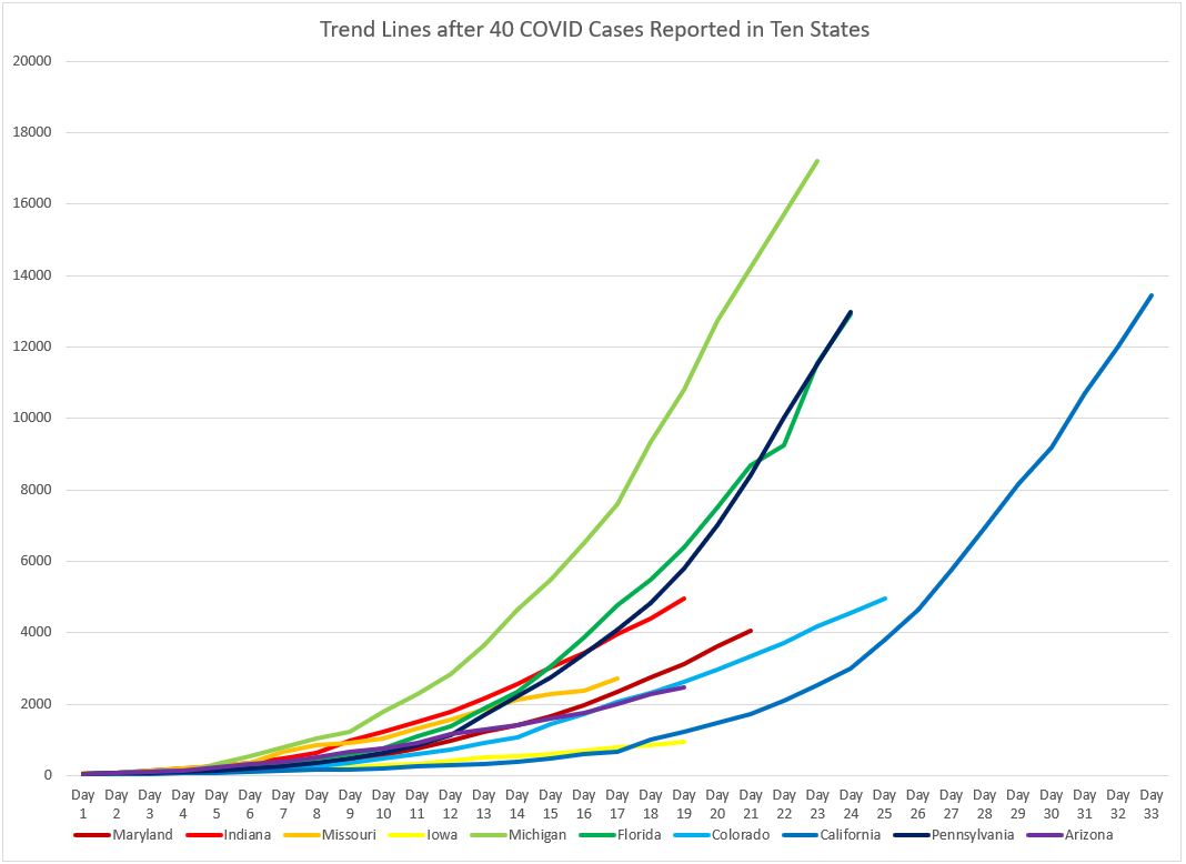 |
| Figure 2. Total Cases over Time after 40 COVID Cases Reported in Ten States |
The last piece of information today provides a glimmer of hope. As mentioned previously in this blog, the reported positive cases are always a bit behind the actual numbers. In other words, the changes we make in behavior today (stay-a-home orders, wearing masks, etc.) will be reflected in the data several days after implementation. Table 1 shows the average increase in the number of cases for two date ranges. The first row is the average percentage increase in cases from the previous four days. The second row is the average percentage increase in cases from the four days prior to that. This data shows that the spread in Indiana, Missouri, and Michigan has slowed the most, of the ten states reported. In other words, although the cases are still increasing over the weekend, they are not increasing at as high of a rate as they were the four days prior. Looking back at Figure 2, you can see a slight shift in the slope of Michigan (light green). To put it in terms we are now all too familiar with, the curve is starting to bend.
 |
| Table 1. Average Percentage Increase in Cases over Four Days for Ten States |
All ten states have a decrease in the percentage of new cases over these two date ranges. One can infer that the behavior changes implemented in the previous two weeks are beginning to be evident in the data. However, some of the changes are so small (Florida, Maryland, Colorado, Pennsylvania, & Arizona), it is difficult to know if it is a decreased trend or a blip in the data. Only time will tell.
So, as always - Stay Home, Stay Safe, Stay Healthy - JRB
No comments:
Post a Comment