Tuesday, March 31, 2020

Adding 3 states: California, Colorado, & Florida

In the previous posts, the focus was on the first five states: Indiana, Maryland, Missouri, & Iowa. Today, California, Colorado, & Florida are added to the graphs. Similar to the other posts, today will be an update of all of the states' totals as well as updates to some of the other information which was previously explored. The purpose of this blog is to look beyond the total numbers at each state and to increase understanding of the trends in each state.

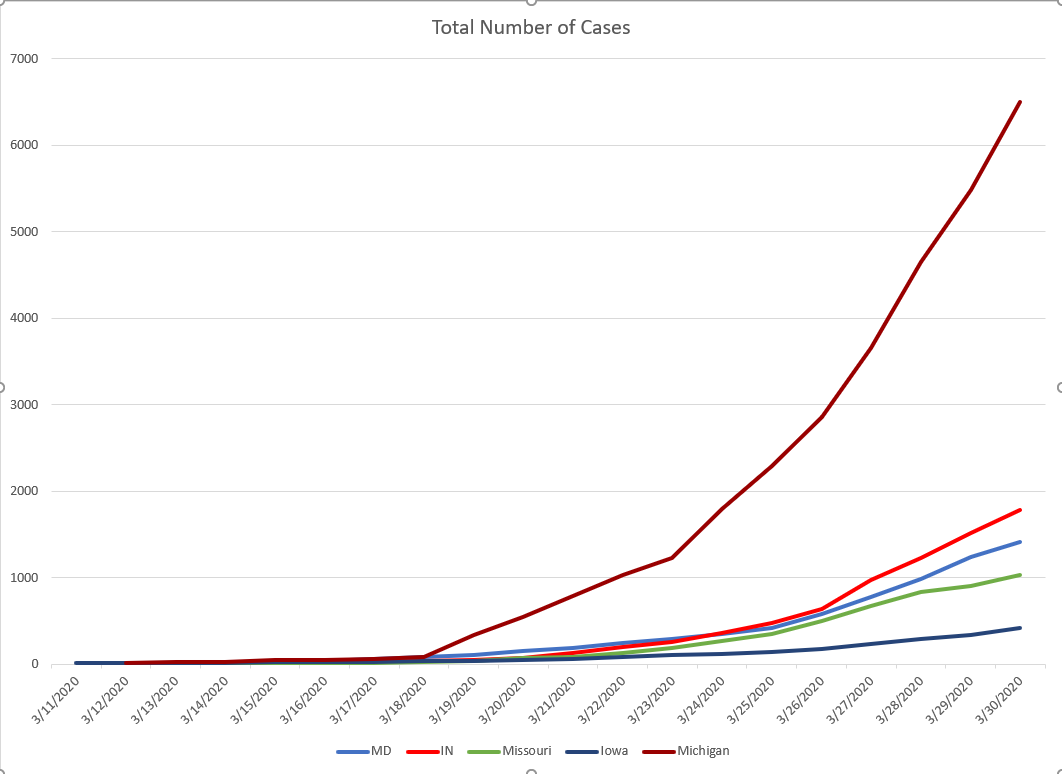
As I gathered the information on the new states, I realized that zero states in this analysis have a graph over time of the totals. The big push from the experts is to "bend the curve." However, none of the states are providing a visual of their curve. This evening, in the national briefing, Dr. Debbie Birx provided a visual of all 50 states included in one chart. You can see that graph here at time stamp 19:45. The data included here is the same data visualized in that graphic. The only difference is, with fewer states included, you can more easily see the trends of each state. In gathering the new data, Florida has the best data display (by far) compared to the other seven states (see it here). It includes a lot of the information examined previously in this blog. However, even Florida does not report the trend line of cases over time.

Figure 1. Total Number of COVID Cases over Time in Eight States
In Figure 1, you can see three of the states represented here following the sharp exponential growth trend (Michigan, Florida, & California). The other five states have not yet experienced that level of growth, and hopefully will not. A closer examination of the new states included in this figure shows that California's case began long before the reports in other states (this will be evident in Figure 2). Florida reported cases after California, but the spread in Florida has outpaced all of the states included in this graphic, besides Michigan. Hopefully, this figure is a clear demonstration of the push to "bend the curve." Iowa continues to report the lowest numbers of all eight states. Another element of note in this graph is the rise in cases at the exact same time in many states. This simultaneous rise is catastrophic for the health care system across the nation, since all states need supplies at the same time.

Adding in the three new states, it is worth looking at the state totals again from a common starting point (see Figure 2). Previously, that starting point was the reporting of 15 cases. This starting point has changed for today to reporting of 40 cases. This is primarily due to California, which reported over 40 cases back on March 5. In Figure 2, the growth trends of the three high volume states tell a different story. California currently has a large number of cases, but as mentioned previously, it took much longer for the state to get to that total. Of the eight states, Michigan is still experiencing the most extreme trajectory of cases.
Figure 2. Total Cases over Time, after 40 COVID Cases Reported in Eight States
Finally, it is worth revisiting the population data, now that other states are included. Table 1 includes the updated total number of cases, percentage of total population, and cases per square mile for each state. Maryland remains the most densely populated state of the eight states represented. Most people will realize that California and Florida are larger in population, by far, compared to the other states. Also, Colorado and California are larger that the others in square miles. Looking at how these geographical and population elements relate to COVID, of the states included, Michigan has the highest percentage of the population with the disease, followed by Colorado. Maryland has the largest number of cases per square mile, followed by Michigan and Florida. Colorado has roughly the same population density as Iowa, but the 3x the percentage of population diagnosed positive.

Table 1. Population, Square Miles, Population Density, and COVID for Eight States
 Looking at all of this data in totality, it is no surprise that the experts are warning that Michigan could be one of the next hot spots. Florida has also been mentioned. This data illustrates the importance of following the guidelines set forth by the CDC. One week ago, on 3/24/20, Michigan had 1791 cases. Today the reported positives in Michigan are 7615, an increase of 425%. 

As of this posting, the global total is over 857,900, the US total over 188,000, and in my county, 227 positive cases have been reported (which is nearly half of all the cases in Iowa). So, as always...

Stay home, Stay healthy, Stay safe.
JRB


Monday, March 30, 2020

5 States: testing breakdown

The purpose of this blog is to examine the state level COVID cases, beyond simply reporting the totals. Examining trends allows for a more complete understanding of the pandemic. The purpose of this blog is not to increase your anxiety, but to increase understanding of the data.

The focus of today's post is two-fold. First, to update the reported cases for each of the five states. Second, to examine the demographic distributions of the positive cases, across each of the states. As of this writing, the global total exceeds 775K and the US is just under 160K. I will not add another state today, since the focus is on the demographics of the cases. Additional states will be included tomorrow. 

First, an update on the data for the five states. I did not update the data over the weekend; in Figure 1 you can see how the total number of positive cases in each state has changed since the last post on 3/27/30. Unfortunately, in the past 24 hours, both Maryland and Iowa reported an outbreak in a nursing home. Today's totals in those two states reflect those outbreaks.  

Figure 1. Total Positive Cases of COVID in Five States, over Time
As the trends continue in all five states, the next aspect to examine (for the first time here) is focused on the testing. All five of the states now report the total number of tests. Figure 2 and Figure 3, taken together, demonstrate the scope of testing across each state. Michigan has tested more people than any of the other four states, but also has the highest percentage of positives, as well as the highest number of cases. In other words, similar to how experts are describing New York, Michigan most likely had community spread long before the testing began in the state. Missouri on the other hand, is testing at a high volume and has one of the lowest percentage of positive cases. Missouri is the best case of the five states when it comes to testing. As more tests become available, the percent positive will decrease even as the cases continue to rise exponentially. 

Figure 2. Total Number of COVID Tests in Five States


Figure 3. Percentage of Positive Cases in Five States


The age of people infected with COVID has been a focus since the start of the pandemic. It was reported early that the disease impacted older adults. Four of the states are represented below in the four pie graphs (see Figure 4) . Iowa is not included here because the state is reporting cases in 20 year age increments, while the other 4 states are reporting positive cases in each decade of age. In reality, Iowa's data follows the same trend. However, keeping the visual to these four states illustrates the consistency. If the ages are difficult to read on the screen, the lighter blue wedge at the top (12:00) is 10-19, and each decade thereafter is around the pie, clockwise. Maryland has reported 5 cases in children ages 0-9. Those numbers are included in Maryland's 10-19 wedge. Overall, there are some differences in percentages across the states, but the trends are fairly consistent. Anyone can contract the virus. 

Figure 4. Positive Cases by Age Range in Four States

Finally, a note on mortality. The percentage of people dying from COVID compared to the number of cases in each state is fairly consistent [range 1.06% : 2.83%]. Maryland had the lowest mortality rate (1.06%), followed by Missouri (1.26%), Iowa (1.42%), Indiana (2.18%), and Michigan (2.83%). Currently, only Indiana has reported an age distribution of the deceased. Indiana and Michigan are both reporting the gender distribution of individuals who have died due to COVID. In both states, the gender distribution of positive case is fairly even (IN: 52% male, 48% female; MI: 49% male, 51% female). This is also the case in the other three states. However, the mortality gender percentages are significantly different in the two states currently reporting this data. In Indiana, 65.6% of the people who have died due to COVID are male, 68% are male in Michigan. Once more states begin to report the demographics of the deceased, this will be further analyzed. However, the evidence right now suggests that males and females contract the disease in similar proportions, but the disease is twice as likely to be fatal in men. Again, these numbers are early and could very well change. 

As always, stay home, stay healthy, stay safe.
JRB

Friday, March 27, 2020

5 States: A deeper dive

After yesterday's post, it was announced that the United States now has more cases than any other country worldwide.  The purpose of this blog is to look at the publicly available data in different ways. My aim is to increase awareness beyond the state and national totals. This is important because only when we have a reference point are we able to evaluate how our own state is responding to the pandemic.  This leads me to the purpose of today's post. I am going to update the totals from the five states already included. Then, I will plot some points where decisions were made in each state. Finally, since my background is in mental health, I will devote a moment to that as well.

As a disclaimer, the data provided here is only as good as the testing. Most states are only testing people with significant symptoms, given the national shortage of test kits and/or materials/reagents require to completed the tests. The real number of U.S. cases will never be known. However, examining the data we do have is still critical.

First, the totals of the first four states (Figure 1) demonstrate Indiana's accelerated growth and Iowa's continued gradual growth. If this trend continues, Iowa will be a case study for how to flatten the curve. On March 14th Indiana had the second fewest cases of these four states, behind Missouri. In other words, Indiana had fewer cases than Iowa on March 14th.
Figure 1. Total COVID Case for Four States

When the Michigan data is included (see Figure 2), it is difficult to see the trends in the other four states, which is why only the first four states are the focus of Figure 1. Today, Michigan's cases increased by 28%, which is actually the smallest daily percentage increase of the five states [range 28%:52%].

Figure 2. Total COVID Cases for Five States
Finally, as I have included on previous days, it is important to have a standard starting point when attempting to compare states. The starting point in this analysis is the day each state announced at least 15 cases. For those specific dates, please see yesterday's entry.

Figure 3. Growth trend of COVID Cases for Five States after 15 Cases Reported
Figure 3 demonstrates that although Missouri has fewer cases than Indiana or Maryland, the growth of the cases in Missouri is happening at a faster rate. Understanding this piece of data is key to understanding why it is not reasonable to compare total cases in the US to total cases in China or Italy. We are several weeks behind each of those countries. Yet, our cases as of 3/26/20 were the highest in the globe. Meaning, our growth rate is higher in the US. It is also important to remember that this is why one cannot compare the number of moralities in the US to the numbers in China, Italy, or Spain. Again, we are behind all those countries when it comes to a standard starting point.

The added information for today is examining when each state implemented specific policies. Figure 3 is the graph we will use to compare when policies were implemented in the five states. In Figure 4, the two policies included are the state-wide closure of schools and state-wide stay-at-home order.
Figure 4. State-Wide Closure of Schools and Stay-at-Home Orders for Five States

Most of the schools in the nation (labels in BLUE) closed around the same time. As a reminder, this graph shows the date of closures after each state announced at least 15 cases in the state. Differences do exist between states regarding stay-at-home orders (labels in PURPLE). At the time of publication, Missouri had not yet issued a stay-at-home order. There are significant policy difference between states. These two policies were selected because they are two of the most consistently implemented policies. Interestingly, most bars and restaurants were closed in conjunction with the closure of schools in each state. Once more states declare states of emergency, those points will be included.  The closure of all non-essential businesses and stay-at-home orders are a critical point in containing the spread. When each state enacted these two orders will most likely be related to the total number of cases once we come out on the other side.

As I mentioned at the start, I want to take a moment to address mental health during this time. It is very easy to become overwhelmed with all the information. It is normal to feel overwhelmed and anxious. Please focus on your self care. In times of high anxiety regaining a sense of control can be helpful. Oftentimes, volunteering gives that sense of control. I know in Maryland, the governor launched a Maryland Unites website to connect people with volunteering opportunities. Other states have most likely done something similar. That is exactly how I found myself delivering for Meals on Wheels this week. As someone who is in a helping profession, volunteering is a piece of my self care. Everyone's self care will look different: read a book, crochet or knit, exercise, work in your garage for hours. Regardless of what you do, you cannot help others unless you are taking care of yourself.

Stay home, Stay healthy, Stay safe. JRB

Thursday, March 26, 2020

COVID: 5 States (IN, MD, MO, MI, & IA)

March 26, 2020

Today the cases across the globe surpassed half a million. The purpose of this blog is to look at the publicly available data in different ways. My aim is to increase awareness beyond the state and national totals. However, if you are interested in total numbers, I suggest the Johns Hopkins Coronavirus Resource Page. For those of you that don't know, the website originally started with one professor and her two doctoral students updating the data. Hopefully, they have more help now.

Today, there will be a total of five states included in the visual analysis. Day one (3/24/20) began with Indiana and Maryland. Yesterday (3/25/20), I added in Missouri. Today, Iowa and Michigan are included. The addition of these two states demonstrates how the coronavirus impacts different states. Similar to the previous two days, I will start with the overall totals for the states. However, Figure 1 only includes the first four states, while Figure 2 includes all five. The reasoning for this will be clear.

Figure 1. Total Cases of COVID over Time for Four States

In Figure 1, you can see that Iowa is on a different trend, at this time, compared to the other three states. Exploring the population data (see Table 1), Iowa has the lowest population density of the five states. The other three states (Maryland, Indiana, and Missouri) are on somewhat similar growth trends at this time.
Table 1. Total Population, Square Miles, and Population Density for Five States.
The story of today, however, is the dramatic data coming out of Michigan. In Figure 2, you can see that the numbers in the four other states are dwarfed by the Michigan COVID totals. At this point in time, I have not had the chance to look at when policies were implemented. That will come at a future date.

Figure 2. Total Cases of COVID over Time for Five States
Again, the total numbers of each state do not tell the entire story. Table 1 reveals Michigan to have the highest population of the five states in this comparison. Although Michigan is roughly identical to Iowa in square miles, Michigan has 3x the population of Iowa. This is where it is also helpful to look at cases per square mile. On this metric, the Maryland and Michigan numbers are very similar. Meaning, Maryland and Michigan have a similar number of cases per square mile. However, Michigan has vastly outpaced the other five states in the percentage of the population with COVID. Today, Michigan reported slightly less than 0.029% of the total population has tested positive. In other words, almost 3 out of every 10,000 people. That is nearly 3 times the percentage of population with COVID in Indiana or Maryland.

The final piece of data for today is to examine how Michigan and Iowa compare to the other three states in growth trend, once 15 cases were diagnosed. Figure 3 represents the data after the first 15 cases were diagnosed and reported. For instance, Day 1 for Iowa is March 12, Maryland is March 13, Michigan is March 13, Indiana is March 14, and Missouri is March 19. The purpose for looking at the data in this way is to have the states at a similar starting point.
This examination of the data demonstrates Iowa's very slow growth trend, compared to the other states. A look back to Table 1 shows Iowa has the lowest population density. However, population density is not the entire story, since Maryland's population density is over three times that of Michigan. Inevitably, there are policy differences at play here as well. In other words, how and when the state level government responded to the pandemic.
Figure 3. Trend Lines of COVID after the First 15 Cases were Reported in Five States. 

Finally, I had a request to include mortality in my data. I have consciously avoided that piece thus far. However, I won't be able to avoid it forever. I am also working on a separate post regarding the data. Unfortunately, zero states' websites show the cases over time at this point. This means I am digging through various postings at the state level or local media reporting in each state. As accountability, I will post all the resources I have used to date to track this data.

Action makes a difference. Stay home. Stay safe. Stay healthy.
JRB

Wednesday, March 25, 2020

March 25, 2020 - Adding in Missouri

The purpose of these posts is to take the data that is publicly available and look at it in different ways. My aim is to increase awareness beyond the state & national totals.

Yesterday, I posted a graph comparing the differences between two states, Maryland and Indiana. I chose those two states because I consider both to be my home.  I also mentioned that I would be adding more states to the graphs. The first request I received was Missouri (thanks, cousin!). As of this posting, Missouri had not updated the total number of cases for today (3/25). Indiana and Maryland both update their websites at 10 am daily, with no other updates on totals throughout the day. Missouri anticipates an update at 2pm today.
Figure 1 demonstrates the total number of cases in each state. This is an identical graph to the one I posted yesterday, with both today's numbers included, as well as Missouri being added to the mix.

Figure 1. The Total Number of COVID Cases for Three States


Another thing I wanted to look at today, now that three states are included, is the trend in the states from a specific point. Since each state has a different starting point of when COVID started to spread across the state, it is helpful to look at the trends from a specific number of cases. Looking at the data for these three states, I selected the day each state reported at least 15 cases as the starting point (Day 1). Each day after the initial day is subsequently ordered. For instance, Day 1 for Maryland is March 13, Indiana is March 14, and Missouri is March 19. Looking at the data in this way, you are better able to compare across states the acceleration of the spread .


Figure 2. Trend Lines of COVID Cases after 15th Case Reported in Each State


The final thing I planned to look at today was also suggested by someone on the original Facebook post. The questions are, what about population and population density? Occasionally, when I am researching a specific topic for my job, I need to dig into the Census. I realize this isn't something most people do. If you're interested in where this data came from, please see this link to the US Census.
Table 1 shows the total population, square miles, and population density of each of the three states. The final two columns calculate the percentage of the total state population with diagnosed COVID and the cases per square mile. Looking at this table, one can see that Missouri is significantly larger than Indiana, nearly twice the size (I didn't know that!). Therefore, the cases per square mile are very low. However, if we look back to Figure 2, we will remember that Missouri is at a different stage in the spread, compared to the other two states.

Table 1. COVID Cases by Population and Square Mile for Three States.


Another request I had was to look at the total number of tests in each state. Unfortunately, Maryland stopped publicly reporting this number a week or two ago. I will watch to see if that changes. If you have a specific state you would like me to add to my next post, please let me know.
Action makes a difference. Stay home. Stay safe. Stay healthy.
JRB


Tuesday, March 24, 2020

Initial Post - Maryland and Indiana


The following text and images were originally posted on Facebook. After a bit of consideration, I decided it may be best to document these trends over time on a different platform. So, here I am.
A disclaimer, I am not a public health researcher, my Ph.D. is in Education. Everything posted here is based on publicly available data.
*****************************
As most of you know, I am from Indiana and live in Maryland. I have watched the two states' responses to the pandemic very closely. Maryland had cases very early and took action very early. Because of the different approaches by the state level government (and watching people's comments on social media), I assumed the day would come when the cases in Indiana surpassed the cases in Maryland. Today is the day.
Action makes a difference. Stay home. Stay safe. Stay healthy.
Because I'm a huge nerd, I created these graphs yesterday, as I waited for today's numbers.